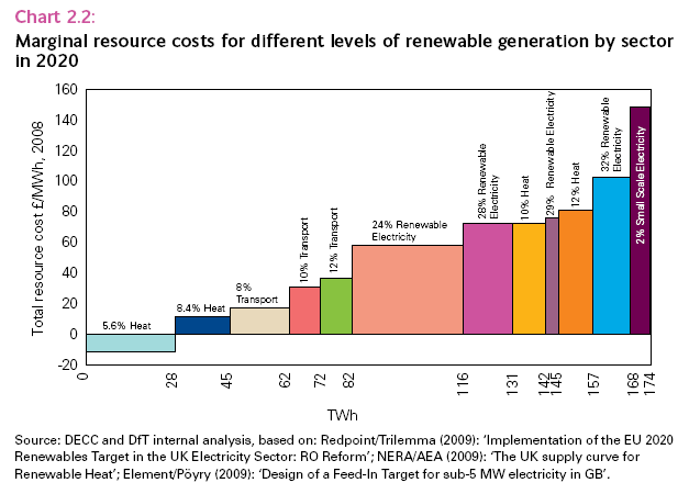
Here's a graph from the Renewable Energy Strategy, of a type that the Government has been growing increasingly fond, as it steps up the complexity of its efforts to calculate outcomes and costs of support policies:

The first and most important point is that it is remarkable how precisely the Government believes it is possible to predict the costs of achieving the 2020 target. But let's nevertheless play the game of pretending that these figures are worth applying some critical thought to.
It is amazing how much the marginal resource costs of various technologies within the three sectors cluster together. One would have thought that one of the fundamental features of marginal costs is that they vary across the piece, and don't proceed in a few large steps. For example, it seems that there are no opportunites for renewable heat that incur marginal resource costs of between £15/MWh (the second, dark-blue block) and £70/MWh (the eighth, mustard-yellow block).
Perhaps I am holding them to too high a standard, and the mustard-yellow block is (for example) intended to contain all potential renewable-heat projects with marginal resource costs between £15 and £70/MWh. But in that case, why does the chart distinguish consecutive blocks of transport energy with marginal-resource costs of £20, £35 and £40/MWh (approximately, see the third, fourth and fifth blocks in the graph)? Couldn't they all have been lumped together like the 10% (mustard-yellow) heat block, or the 24% (sixth, salmon-coloured) electricity block? And doesn't this contradict Government policy on support mechanisms, which tries to tailor the support-level to ensure that projects all get only just enough to make them viable (projects of each technology being consistent in cost and the Government's knowledge perfect).
As for the details:
It seems that 5.6% of our heat can be delivered by renewable energy at lower cost than conventional heating fuels. With such advantageous economics, it is somewhat disappointing that renewable heat currently contributes under 1%, and most of that has been supported by grants and other incentives. Clearly, large numbers of us just like burning our money (maybe the Government think that would be a cheap way to keep warm too).
It also seems that we can achieve 8.4% renewable heat and 12% renewable transport at lower cost than we can deliver any renewable electricity. Doesn't this make the earlier decision to focus primarily on renewable electricity seem not just blinkered, but downright perverse? Even now, the Government is fighting shy of going beyond 10% renewable transport and engaging in dodgy European re-definitions to achieve even that, when their figures suggest that they should be cruising to 12%.
The reform of the Renewables Obligation to introduce banded support for different technologies only a few months ago was predicated on the assumption that different technologies had different resource costs. That was within an overall target of 20% renewables as a proportion of electricity generation. But according to this graph, we can deliver upto 24% renewable electricity of various types at one monolithic resource-cost. And that resource-cost is significantly higher than the buy-out price in the RO plus other green benefits such as the CCL, which determine the cost to society of supporting renewable electricity. So, according to this graph, they should expect no further increase in the contribution from all technologies awarded a single or partial ROC per MWh, as this would appear to be insufficient to cover the projects' costs. Knocking most of the mature technologies, and the vast majority of current production, out of the equation makes 24% look truly ambitious. Or alternatively, if this includes projects with lower resource costs, truly wasteful (by the Government's logic).
Then there's the strange bit of maths that says that 34 TWh of renewable electricity (116 - 82) gives renewables a 24% share of the electricity market, but a further 15 TWh (131-116) only adds another 4% (taking the total to 28%). Similar "ideosyncracies" can be found littered amongst the figures in this graph.
And what about "small-scale electricity". According to the Government's own figures above, it is ludicrously expensive and delivers not a lot (6 TWh). And yet the Government is rushing to put in place the micro-gen Feed-In Tariff that will support this technology by April 2010, whereas it is taking rather longer over the Renewable Heat Incentive, which, according to this graph, will deliver far more renewable energy at much lower cost. Perhaps they are giving us a bit more time to realise how stupid we have been and install projects producing 5.6% of our heat from renewable sources without subsidy, before they introduce the support mechanism.
As its previous interventions fail to deliver, the Government decides that it needs more "sophisticated" (i.e. complex) analysis and measures to correct the failure of their previous interventions. But does it seem, taking this graph as an example, that this sophistication is yielding markedly more-accurate and better-informed assessments that will allow them to plan their way to success, with minimum "deadweight costs"? Or is it just increasing the volume of bullshit and misinformation, for taxpayers to pay for, the energy industry to wade through, and the Government to fool itself that it is governing prudently and rationally as it further complicates and degrades the market?
If you can make sense of this graph, let me know. Or, if you spot other "ideosyncracies", let me know too. I expect more of the latter than the former.
